By Ed Power
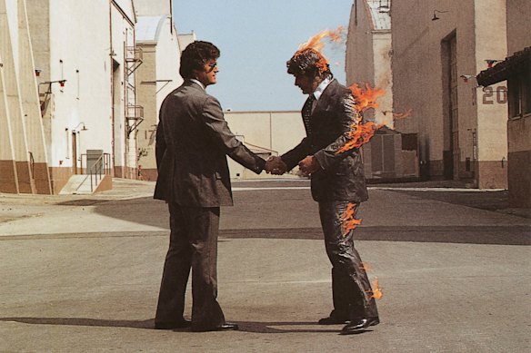
London: The story of Pink Floyd is a whirlwind of death, madness, bad blood, Herculean guitar solos and towering egos. But one of the highest-profile casualties in the tumultuous history of the band that put the “grrr” in progressive rock was the moustache of stuntman Ronnie Rondell Jr, half of which was famously singed during the 15 attempts it took to photograph the instantly iconic cover of the band’s 1975 masterpiece, Wish You Were Here.
As captured by regular Pink Floyd collaborator Aubrey Powell on the Warner Bros studio backlot in California, the image of a smiling Rondell with his business attire ablaze, shaking hands with another man, became immediately part of the band’s mythology. There is an argument that it is just as well known as the band’s music, which has gone in and out of fashion since the prog era drew to a close in the late 1970s. But now there is a bittersweet coda with the news that Rondell has died. He was 88.

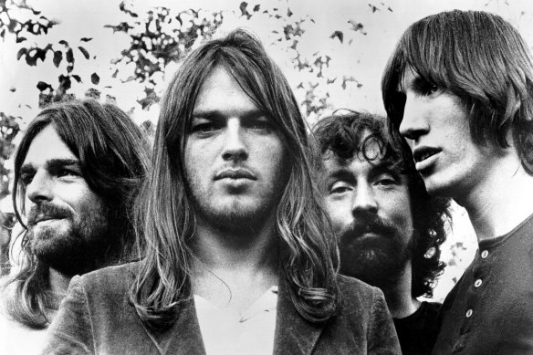
Pink Floyd in 1973, the year they released The Dark Side of the Moon: (from left) Rick Wright, Dave Gilmour, Nick Mason and Roger Waters.Credit: Getty Images
For Rondell, Wish You Were Here was just one flashpoint in a life full of thrills and spills. His career spanned eras – from 1960s Westerns such as How the West Was Won to superhero movies like Batman & Robin. But Wish You Were Here is in the first line in his obituary – and with good reason, as he had a part in one of the greatest-ever album covers.
Typically for Pink Floyd, however, both the record sleeve and the album were accompanied by soap-opera levels of drama. Here we delve into the making of five of their most celebrated LPs.
Atom Heart Mother, 1970
Pink Floyd would look back on their fifth studio album with a degree of ambivalence. Though it went to number one and was one of their biggest hits up to that point, they came to regret its shaggy, experimental quality (including the sound of frying bacon and a kettle coming to the boil).

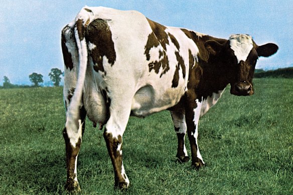
The cover art for the Pink Floyd album Atom Heart Mother.
“A load of rubbish,” is how guitarist David Gilmour characterised the record, which took form as the group were coming to terms with the exit of their original leader, Syd Barrett – shown the door after his out-of-control acid habit left him hollowed out and permanently frazzled. “We were at a real low point… I think we were scraping the barrel a bit at that period,” said Gilmour.
Scraping the barrel they may have been with songs such as the 13-minute Alan’s Psychedelic Breakfast and Breast Milky (part of the side-one song cycle). But in one respect, the LP was boundary-shattering – and that, of course, has to do the sleeves designed by their regular collaborators, the aforementioned Powell and Storm Thorgerson, who worked as Hipgnosis (and who knew the Floyd from their early days in Cambridge).
Thorgerson and Powell would later come to be regarded as masters of the art of album design, but in the early 1970s they still had the mindset of unruly undergraduates making it up as they went. Which is how they came to present Pink Floyd with the mocked-up album sleeve consisting of a photograph snapped by Thorgerson of a Holstein-Friesian cow named Lulubelle III.
It was intended largely as a joke, but Pink Floyd loved its daring – no album or artist title, no band photograph. Their label, EMI, was less enamoured of the concept. “Ah, Friesians,” said Len Wood, the boss of EMI Records. Still, he knew better than to get in the way of a band whose blend of artiness and whimsy had already brought great success – and three weeks later, Atom Heart Mother was topping the charts.
Dark Side of the Moon, 1973
Determined to improve on the botched and indulgent, as they saw it, Atom Mother Heart, Pink Floyd produced their masterpiece, Dark Side of the Moon. According to Roger Waters, it was the last time the band were all on the same wavelength, and tensions between him and guitarist Gilmour would be exacerbated by the success and fame that followed in the record’s wake.

The cover of the Pink Floyd masterpiece Dark Side of the Moon. Credit: FDC
But while the music was among the best the Floyd would commit to tape, part of the appeal also lay in the masterful artwork by Hipgnosis, then busy parlaying their association with Pink Floyd into a successful career designing album covers for everyone from Led Zeppelin to 10CC.
Unusually for Hipgnosis, the famous image of a white beam of light passing through a triangular glass prism and splitting into a spectrum of colours is entirely a work of graphic design, with no additional photography.
“The idea itself was cunningly cobbled from a standard physics textbook,” Thorgerson said in 2003. Powell added: “In this book was a photo of a prism on a piece of sheet music and sunlight coming in through the glass window. It was creating this rainbow effect.”
The band loved it – to Thorgerson’s chagrin, as it was the first of several mock-up album sleeves he had prepared. Didn’t they want to see the other options, he wondered, at a meeting at EMI Studios in Abbey Road? Drummer Nick Mason would later dub him “a man who couldn’t take yes for an answer”.
Wish You Were Here, 1975
Pink Floyd were slowly falling apart when they came to make their follow-up to Dark Side of the Moon. To the perpetually angst-ridden Waters, the title track was a lament both for the absent Barrett (unrecognisable when, bloated and confused, he visited the group during the recording sessions) and also for the fact that they were becoming strangers to one another.

The famous cover of Wish You Were Here with stuntman Ronnie Rondell Jr on fire. He has just died aged 88.
He was commenting, too, on how the record business turned musicians against one another while cheerfully ripping them off.
That was the message that Powell and Thorgerson seized upon for the cover. “There was a lot of anger, especially in Roger, about the record business,” said Powell. “So we’re talking about the absence of sincerity, about people being ripped off.”
They had the perfect image in mind: two businessmen shaking hands, one on fire – symbolising the cynical nature of the music industry and how someone always ended up getting burnt in a deal.
However, in the era before CGI or sophisticated animation, a picture of a burning man required a man to be literally set alight. This led them to Stunts Unlimited, where none of the resident stuntmen were up for the gig. “Who wants to be on a record cover when we can be in The Towering Inferno?” said one.
There was just one exception – veteran Rondell, who was excited to take part in what he knew to be a dangerous undertaking, staying on the spot while on fire (“You’re standing still and fire moves”).
A few days later, Rondell was on the Warner Bros set in Burbank, in a suit and wig. The clothes were covered in flame-retardant material while Rondell was smeared in gel. They took 14 shots, hoping to get the perfect image – but Powell wanted to press on. On the 15th time, the wind changed direction, setting ablaze one of Rondell’s eyebrows and half of his moustache.
Animals, 1977
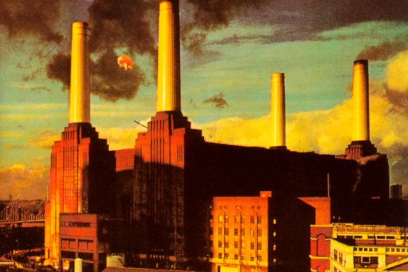
Hipgnosis had started to lose the run of themselves by 1977, and Pink Floyd’s dark, uneasy Animals. They suggested a cover image of a child watching his parents copulate “like animals”. Thanks but no thanks, said Waters, who had an idea of his own: a giant inflatable pig floating over the partly decommissioned Battersea Power Station in London.

The cover of the album Animals, featuring the famous flying pig.
Tension was running high leading up to the shoot, though not for the traditional rock ‘n’ roll reasons.
“Storm and Roger’s relationship by the time we did Animals was pretty fraught anyway,” Powell said, “and actually not necessarily related to Animals. They were squash partners. And Storm was notorious for turning up late to every single meeting we ever had in our careers at Hipgnosis. And he did the same to Roger. He turned up later and later and later for squash games. In the end, one day, Roger left the squash court, walked out and said: ‘That’s the last time I’m ever playing with you.’ That was a defining moment in Storm and Roger’s disintegration in their friendship.”
Undeterred, Floyd commissioned a 12-metre inflatable pig – made by Ballon Fabrik, the German firm that had constructed the Zeppelin airships. On December 2, 1976, the band and Powell arranged for 14 photographers to snap the pig over Battersea Power Station. But having initially declined to inflate, the airborne pig then made a dash for freedom – when a cable snapped, it strayed into the Heathrow Airport flightpath and two RAF fighters were scrambled to track it down (it eventually turned up in the field of a farmer in Kent).
After all that, the images were judged unsatisfactory, and so the band used a montage of the porcine balloon and of the ominous skies above the power plant – a metaphor for the dark forces of capitalism tearing apart the now thoroughly unhappy Floyd.
The Wall, 1979
Waters was fed up with being a rock star, and his 1980 opus, The Wall, was a meditation on the divide he felt had been imposed between artist and audience. There was also a wall between him and the rest of Pink Floyd, and he would leave shortly afterwards – imagining that he had called time on the group (Gilmour and his bandmates felt otherwise and carried on Waters-less).

The cover of The Wall, Roger Waters’ meditation on fame and the great divide between him and his audience.
A sign of changing times was the fact that The Wall’s cover was designed not by Hipgnosis but by cartoonist Gerald Scarfe. He had struck up a friendship with Waters, having collaborated on the stage design of the Wish You Were Here tour.
“Roger Waters and I got on pretty well. We had the same ironic/sardonic view of the world and we played a lot of snooker. I think he trusted me,” Scarfe would say.
“From my point of view, it was a happy arrangement,” Scarfe continued, “because Roger in no way tried to impose himself on my work. He had the philosophy that if you employ an artist, you don’t try to change what he does. We were working in separate fields – music and art – and yet the two helped one another. He saw the whole sleeve as being designed by me, but it was Roger’s idea from the beginning that it should be a blank wall.”
The words “Pink Floyd” and “The Wall” were scribbled out in a hurry.
“The writing on the front was just written by me, very quickly,” he said in 2022. “I think I would have done it with a little more panache these days. We were actually worried about blemishing the purity of the cover, and almost wanted not to have a logo on the front.”
The approach was the opposite of that of Hipgnosis. There were no elaborate photo shoots, no grand concepts. Just a cover as stark and blunt as the message of the album: that being a rock star wasn’t much fun, and global fame was a hell from which there was no escape. All in all, it has weathered the years rather well.
The Telegraph, London