Liquid Glass and windowed apps: All the changes coming to your iPhone
By Tim Biggs
Your iPhone and other Apple devices are set to undergo a major design overhaul this September, with the arrival of the company’s new Liquid Glass visual language, along with a host of new features and app updates. The changes, first announced in June, are now available for those enrolled in Apple’s public beta program.
Apple cautions that early versions of the software can be unstable; in my early testing, I have noticed some visual glitches and choppy performance. While I haven’t had any major issues or lost any data, it’s best to be careful and avoid putting it on the primary devices you rely on.

iOS 26 comes with the biggest visual change to iPhone since 2014.
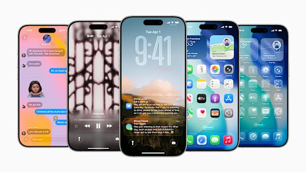
The visual overhaul is significant and touches every part of the device software, as well as all of Apple’s own apps. The design is very much inspired by the Vision Pro headset, with its glassy round elements and its augmented reality; in iOS 26, that begins on the iPhone’s lock screen.
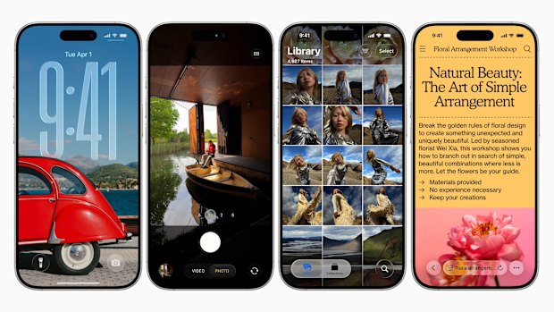
Previously, your clock has been able to partially disappear behind subjects in your wallpaper, but that’s taken to another level here. Using your recent iPhone photos, you can choose to generate a spatial scene and/or let the phone extend the image, which utilises AI to create extra visual information around the edges or behind the subject.
When you move the phone, the angle of the photo shifts, giving the impression of depth, like you’re looking at real life through AR goggles.
The clock will also change height to suit the photo, which sounds silly, but it does make your lock screen look like a professionally laid-out magazine spread, and I like the way the clock looks when it’s super tall. It shrinks up if your notifications fill the space or you scroll them.

iOS 26 has redesigned the lock screen, camera app, photo library, Safari browser and more.
On the home screen, almost every element has been given a glassy update. Icons become 3D stacks of shiny material, widgets look like big round panes with information printed on them, and the lighting changes as you move your phone.
Elements like the highlight magnifier, search bar and Safari menus have been transformed into translucent bubbles that realistically refract what’s underneath, complete with warping and rainbow effects at the edges.
To be perfectly honest, I don’t think Liquid Glass is a better aesthetic than what currently exists on Apple devices. That’s not to say it looks bad, but it’s a strange swap from perfectly modern flat and vibrant visuals with touches of frosted transparency, to a colder and more graphically complex design, which looks like a much better-realised version of what designers were shooting for in the 2000s.
Starting with the home screen, my layout definitely looked worse when I switched to iOS 26. So many of the app icons have white backgrounds, and with Liquid Glass removing outlines and adding specular highlights, they looked like they’d gone through a weird Photoshop filter. But luckily, the system has settings to change that.

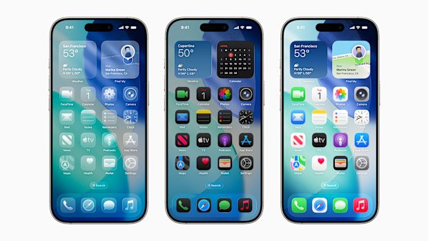
Transparent, dark and default light versions of a similar home screen layout.
Moving from the default home screen to “dark” automatically replaces the white or coloured backgrounds on most apps with black, which looks better. You can also choose “clear”, which converts app icons and widgets into transparent panels with no colour at all. This can look really nice, depending on your background, and you have an option to light up or darken the elements so they remain clearly visible. The final option is “tinted”, which is similar to clear, but lets you choose a single colour for your glass panels.
After some tweaking, I really liked the look of my clear icons, and the monochrome layout has the same appeal as the setups on HMD or Nothing’s Android phones, sapping the colour out of your icons, so your phone looks less like a casino. It works best on big simple icons, with more complex images (like on many games) just becoming greyscale rather than convincingly glassy, but things will only improve as developers update their own icons.
One of the bigger issues with transparency is that the readability of the elements will change depending on what’s underneath.
For example, I frequently had a hard time with the text on app icons, notifications, widgets and web browser elements. I also found that moving transparent panels, or panels that appear over scrolling content, were a bit uncomfortable to look at, like peering through thick aquarium glass on a conveyor belt. This could be something I get used to, but if not, there is an option to “reduce transparency” found in the accessibility options, which makes all these panels an opaque grey.
Overall, it is a graphically impressive effect, but inconsistent in its current state. When big transparent panels sit over bold graphics, it gives the device a roomier look. But moving panels over text and more complex elements can feel distracting and unnecessary compared with the existing style. It’s worth remembering that this is not the final product, and Apple still has time to refine it before a presumed wider launch in September.
There are several non-design upgrades, including a new app to manage your games, Preview to more easily handle PDFs, live translations, and the ability to analyse what’s on your screen with AI. But in addition, iPad has been given a host of updates related to multitasking and productivity. It’s not enough to make the tablet feel fully like a Mac, but it should be a welcome change for anyone who uses their iPad in place of one.
There’s a redesigned Files app and a new menu bar, both of which let you interact with apps in a way that feels closer to a desktop computer, and you can now add folders to the dock, which is good for de-cluttering. But the biggest change is that apps can now be run in windows of practically any size and shape, which is a significant improvement over the existing split-screen system.
When you first open an app, it will be full-screen by default, but grabbing a white curved handle in the bottom right will let you resize it. After that, you can grab it by the top edge to move it anywhere you want. Or you can flick it to the left or right to have it take up half the screen. The app will remember its size and shape, even if you close it.
Apps running in a window also get a new menu in the top left, resembling the three dots from Mac. Green returns the app to full screen, yellow minimises it to the dock, and red closes it. Hold this menu to get some quick arrange options, for example, to make the app take up a quarter of the screen, or a vertical third.
Using apps this way does take a little bit of re-learning. A screen full of windows can really feel streamlined, as they all stay active and can be interacted with, so you can scroll two at the same time or copy and paste between them with ease. When you swipe up to return home, you can have all the apps close or jump to the sides of the screen ready to be resumed, depending on your settings.
If you want to manage multiple groups of apps without setting them up each time, you need to turn on Stage Manager, which adds a “recent” list you can summon by swiping in from the left.
There are a whole heap of multi-finger shortcuts to learn for jumping around and interacting with windows, and in expected Apple style, they work great once you’re used to them – but you’ll need to study the explanations in Settings first.
If you like the iPad the way it is, there’s no reason to fear. The changes are completely optional; you’re asked which experience you’d like when you set up the device or upgrade to iOS 26.
Get news and reviews on technology, gadgets and gaming in our Technology newsletter every Friday. Sign up here.